Lighter and Brighter
Before & After
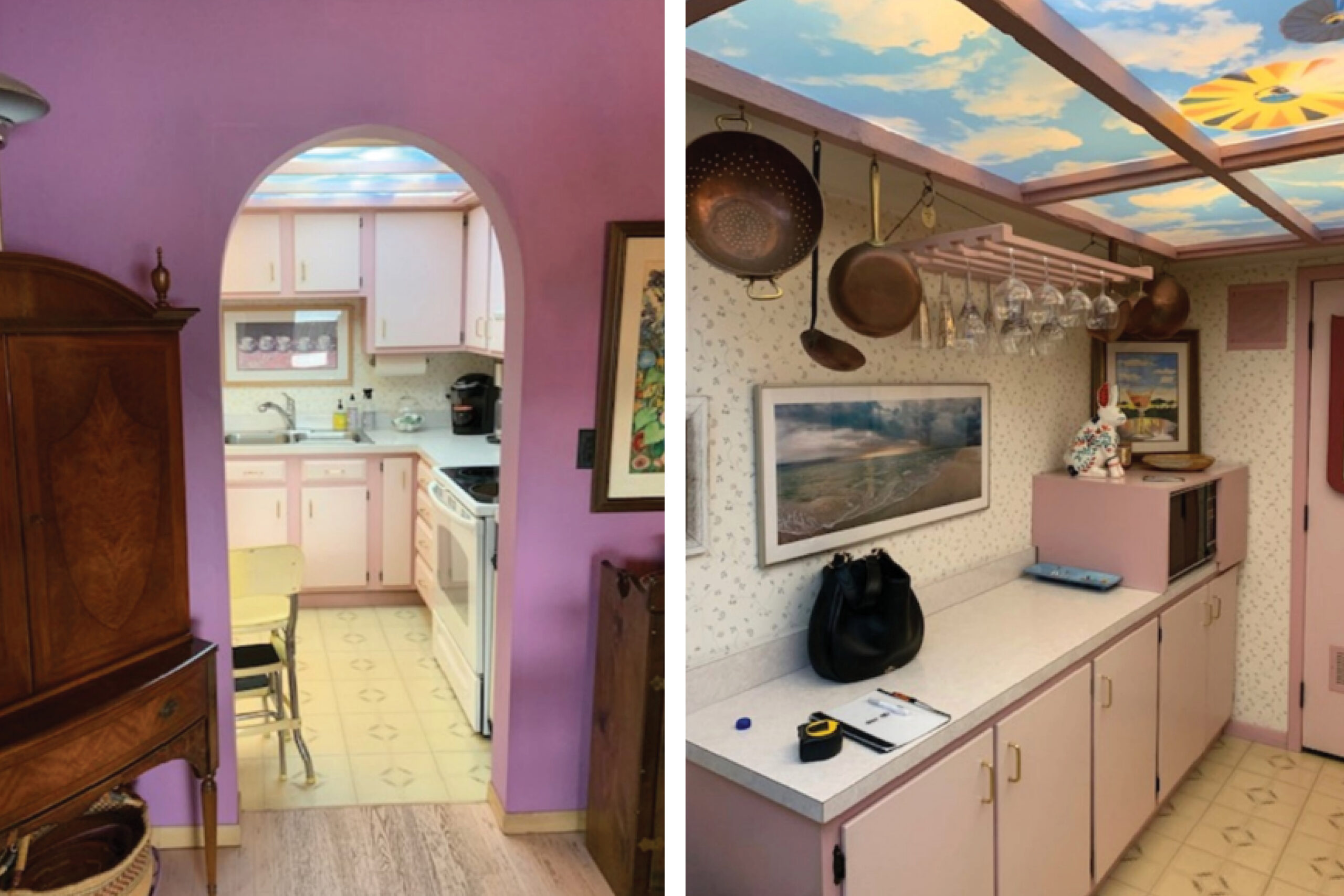
A few “before” photos of this condo kitchen show a claustrophobic layout, funky dropped ceiling and clashing colors.
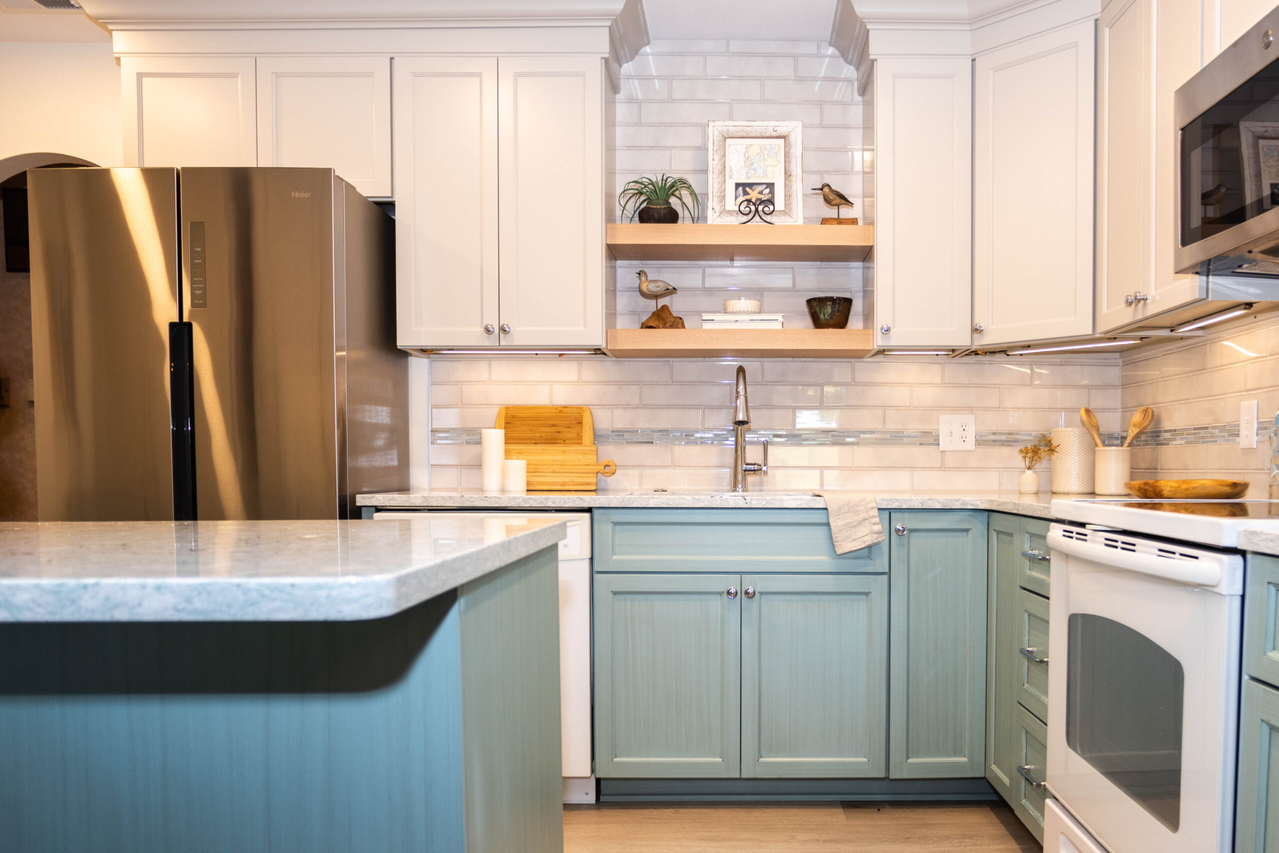
The new palette includes natural wood tones, a hint of muted green, and lighter colors to help the space feel more open.
Plans & Renderings
A gas line and mechanicals hidden in soffits had to be addressed before any other improvements could be made. We opened up a portion of a wall and with that we could maximize storage space with new handcrafted cabinets.
After tackling the tiny footprint by opening up a portion of a wall and maximizing functional storage space, the kitchen felt lighter, brighter, and more connected with the rest of the home.
The details are always important in any design, but even more so in smaller spaces. Surfaces, colors, tile and hardware elements were all carefully selected for maximum impact and function.


